1. Why Checkout Optimization is a Revenue Problem
What Most Stores Get Wrong About Checkout
Many brands spend months perfecting their homepage, product listings, and ads but treat checkout like a technical formality. Yet what they miss is that e-commerce checkout optimization is where actual revenue happens. The checkout process must be frictionless; otherwise, every other investment (from ads to UX) is wasted.
Minor issues like unclear field labels, slow-loading buttons, or missing payment options create enough friction to scare off ready-to-buy customers. Some platforms still require users to create accounts, validate emails, or manually re-enter shipping data; these are all friction points contributing to checkout failures. Many teams overlook the real cost of a poorly designed checkout process. They assume a few extra clicks or required fields are harmless, when those micro-frictions can seriously derail the user’s momentum. What’s often missing is an understanding that hesitation, caused by even the most minor obstacles, can quickly turn into frustration, and eventually, abandonment.
The Link Between Abandonment and UX Failures
Cart abandonment isn’t always about a change of heart and it’s often a response to friction. Most shoppers don’t give up because they no longer want the product; they give up because the process makes it harder than it needs to be.
Maybe there are too many steps, the form feels overwhelming, or something just doesn’t load right on mobile. These aren’t dramatic, obvious failures, but they create just enough tension to break the flow. Over time, that kind of small, silent friction has a real impact on conversions.
A well-designed checkout doesn’t draw attention to itself. It simply works. The moment users have to stop and overthink, they start walking away.
Check out UX best practices aren’t just buzzwords, they solve fundamental behavioral blocks. Features like step-by-step progress indicators, in-line validation when users type, and the option to check out as a guest can make the difference between a completed sale and a lost customer. Checkout should feel seamless and low-pressure. The more comfortable and informed users think, the more likely they are to complete their order.
When this trust is eroded by clunky interactions, vague instructions, or unnecessary hurdles, even the most interested shopper will abandon ship. Optimizing these micro-moments helps build a flow that feels logical and effortless.
2. Key Strategies to Improve Checkout Flow
Simplify the Steps
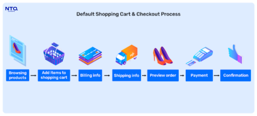
A frictionless checkout often involves subtraction, not addition. The more steps users need to take, the more likely they are to reconsider. That’s why simplifying the checkout is all about eliminating barriers to conversion.
Trimming down the number of pages, reducing form fields, and focusing on what’s necessary are all steps in the right direction. Users want speed and clarity, not forms that feel like an application.
This is where intelligent design makes all the difference. Built-in autofill features, predictive address suggestions, and real-time error checking give users confidence as they move through each step. Better still, allowing users to adjust their cart without jumping to another page keeps them focused and avoids unnecessary back-and-forth.
Though small on their own, all of these enhancements collectively contribute to checkout flow optimization. It’s not just about a cleaner interface but about creating momentum that doesn’t get interrupted.
Optimize for Mobile from the Ground Up
Mobile users don’t behave like desktop users and your checkout flow shouldn’t treat them the same way. A great mobile checkout isn’t just a smaller version of your desktop site. It’s a tailored experience for swiping, tapping, and quick decisions.
That means making buttons large enough to tap without zooming, keeping input fields minimal, and supporting digital wallets like Apple Pay or Google Pay so users can check out in seconds. The fewer steps, the better.
When you improve the mobile checkout experience, you’re not just removing friction—you’re giving customers a reason to stay and finish their order. Mobile shoppers are quick to move on if something feels clunky. Smooth progress indicators, sticky “Place Order” buttons, and real-time feedback help keep them focused and confident in their confirmation.
Reduce Checkout Abandonment with Smart Design
Businesses need to take a diagnostic approach to truly reduce checkout abandonment. They can identify the exact friction points in the process using tools like heatmaps and session replays.
Often, the solution is as simple as reordering form elements, reducing the required fields, or increasing the visibility of trust elements such as payment security icons. Visual cues and clarity on what’s coming next help maintain psychological momentum. Every element on the page should reinforce clarity and trust.
3. Fixing the Backend for Long-Term Gains
How to Optimize Payment Gateway Performance
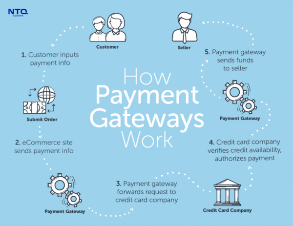
Even the most intuitive front end will not convert if the payment backend fails. Brands must monitor gateway response times, failure rates, and support for regional payment methods.
Ensuring the infrastructure supports tokenization and fallback routing for failed payments helps increase payment gateway conversion rates. With more consumers using mobile-first payment tools, the performance of this part of the flow becomes mission-critical.
Structuring the Checkout for Scalability
Scalability is not just about traffic—it’s about flexibility. Structuring the checkout into modular components allows you to launch new features like promo codes or loyalty programs without disrupting existing flows.
This modularity enables ongoing checkout process improvement, especially as your catalog, customer base, and operational requirements evolve. Choosing a headless commerce setup can further separate the front-end from backend dependencies, making iteration faster.
4. What NTQ Europe Delivers
At NTQ Europe, we’ve helped e-commerce platforms across Europe improve their entire funnel through more innovative front-end architecture and real-time analytics.
Our team focuses on reducing friction at scale while ensuring consistency across browsers and devices. Whether you’re aiming to streamline UX or increase checkout flow optimization, our team can help. If you’re ready to optimize e-commerce checkout with long-term impact, our tailored solutions are built to convert.